
Role: UI Design (native mobile), Prototype Development
First Horizon is a growing regional bank headquartered in the mid-south. Between merger phases, they’re just beginning to differentiate their digital platforms and embed customer experience journeys along with design thinking into their workflow considerations. A major area of potential improvement is the mobile app in general, but more specifically the mobile deposit feature. In this lab we investigated customer reactions to different potential design flows.
TL;DR / Just show me
Flow 1, the more expected/average one


Flow 2, a little more experimental


Storytime

Retail Banking app’s landing screen
In previous labs, I noticed that test participants often grabbed the scrollbar to move around rather than using the scroll-wheel — sometimes missing and being taken out of the (remote, Webex) experience. I made this one fullscreen and that fixed the issue!
We did, however, still have some issues conducting this type of lab through remote control of the tester’s computer: connection speeds, audio issues, and screen sizes. Running labs during Covid-19 times proved to be its own experiment.
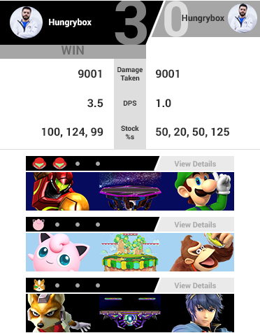
Here's a completed match of 3 games. Competitive Super Smash Bros is a 1v1 game with one character per player and several "stocks" (lives) per game. The objective is to force your opponent to run out of stocks
The style inspiration put forth by the team was the power scouter from DBZ and other "futuristic" interfaces from 90s cartoons. While they definitely had some cool shapes, those were hard to use in the limited confines of a mobile screen. Instead, I combined the chunkiness and angles used in both those inspirations and the menus of the Smash games. The black and grey were originally just for the wireframe, but I started to like it once the colors came in.


Here is an in-progress match. Who will win?! I also included an instance where for some reason something may have gone wrong with the data collection, so the viewer can't click/tap in for more details but they can see the guaranteed basic character and stage information.


This is a popover modal of the game's more specific data. It was originally designed as its own page, but a modal fits better within the infinite-scroller framework. You can see the summary details still, and now additional information like badges earned (images shown above and below), a graph displaying the range at which they lose stocks in, and a scrubbing timeline of the game's major events.

The original plan was to get this pushed out by a tournament called Evo (or Evolution) at the beginning of August. I had completed my design but time was running out and the junior developer responsible for the project had a lot on his plate. I developed a quick little version with Bootstrap to help in formalizing some of the spacing and proportions, test out my images, and hopefully lend whatever help I could. It's not much (and realistically he's probably not using it at all), but if you'd like to see that the link is below. It's best viewed on a mobile device!