

Hello, Spencer
Hello, Spencer
The field of UX design is still somewhat new and in flux, and therefore generally means different things at different companies depending on how they've decided to approach their workflow. Don Normer (who coined the term) defines it as, "encompass[ing] all aspects of the end-user's interaction with the company, its services, and its products," because he, "thought Human Interface and usability were too narrow [and] wanted to cover all aspects of the person’s experience with a system, including industrial design, graphics, the interface, the physical interaction, and the manual." That's quite a lot! Because it describes the majority of what a business's product is everyone involved should be a little bit of an experience designer. At companies where they have larger user experience teams, it's not uncommon to see people of disparate backgrounds functioning in the role.
But that's other places, what is it that Full Measure Education is looking for?
If what you need is someone focused on how your users will solve/approach their problems, the "why" concept of your product (the most commonly found difference between UI and UX roles), then that may technically fall under the purview of a product manager if you need to do the startup thing and blend roles. Assuming you need the person who takes on the bulk of this kind of ideation, research, and user-advocate role to be the designer, I've included a few thoughts I've gathered on ed tech that you may be able to use below.

The "easy" definition of a UX designer that you'll run across is someone who creates wireframes as the bones of the software. Thinking out what the steps to the product are, what order they should go in, and roughly where they appear. While not incorrect, it's also not the whole picture. My studies included wireframing and touched on personas, and during my time at Homesnap I iterated on previous designs as well as new features. Below you can find what I could still scrape together of the planning side of my Homesnap work, most of which may be long-gone.

“Don't confuse process for outcome -- knowing UX practices like personas, flows, and wireframes is important, but not sufficient to delivering great experiences. More important is a UX mindset -- a commitment to seeing the world from the perspective of your users and doing everything you can to make sure what you're doing makes sense to them," says Peter Merholz. The skills of both a UI and a UX designer (in software) center around the interactions and layouts presented, but the roles are often separated in order to allow for more attention to be paid in one area or the other. If some of your larger concerns are the ease of use, learnability, and creation of the experience your users are having... that's a UI designer! To have another look at my "thoughtful approach" head back over to my portfolio, or to see a handful of UI-based experience improvements I took note on look below!


Research
Research
Sam mentioned that much of the work is in service to community colleges, providing a branded resource for communication with students to establish a sustainable process for their success. With a little over one third of the undergraduate population but just a 39 percent graduation rate within 6 years, community colleges are in dire need of tools to help their students make the right decisions and support them through the entire process. Because of funding cuts, they often need to get creative about the way they deliver on the promise of education and are pressured to provide more access, opening up an easy pitch to take some of the work off of their plate. They're also in a more nimble position compared to universities, making them the perfect petri dish to search for a way to make a real difference with student bodies across the country.
Frequent problems specific to community colleges are:
- Students ending up stuck and "spinning their wheels" because of a lack of course structure.
- Being forced to take remedial classes before they can start to work toward their goals, then giving up when they're too far away from any momentum.
- Finances
Some of the most successful programs combined access to tutors and advisers, free textbooks and public transportation, financial aid, and guaranteed access to necessary courses. Obviously it's much easier to concentrate on coursework and the direction you're headed in when you have some guidance and security. I only have so much access to your app without a login, but so far I can see that you touch on adviser access, funding projections with eventual scholarship search, and a simple tool for researching pathways to careers. That's a pretty great start! Here's some other thoughts on things that may help boost performance more:
- Because I can't really see it, how involved are the in-app chat advisers? Is the app just a way to connect the student to a person at the school or do you provide additional remote advisers? Are the advisers listed in the "Adviser" section the contacts in the app, or is that in reference to the faculty advisers designated by the school? Do they only advise on the kinds of things that are in the app, or are they available to provide mentorship and help with coursework?
- While you don't have much access to the physical side of each school (that would be a large investment) and so can't necessarily set up access to textbooks, is there a way to include each school's permissions (and a viewer for on-the-go) to academic publications? Is there a partnership that can be made so that you can offer colleges discounts to online/digital publications on the books so that students don't need to buy them?
- Interviews with people who have experience in the careers would be really helpful in the descriptions for each job. Granted, it would take a long time to compile but having the knowledge they provide would also be beneficial to creating more nuanced and directed questions to help guide students in the "Skills and Interests" quiz. Having more optional content in the quiz may also increase user investment in the platform; people love using quizzes to learn more about themselves which adds (the ever-popular) "gamification" to the platform, and having more information to read through would add additional guidance, hopefully lessening the "wheel spinning."
- Are there any resources provided after selecting a path for job hunting and additional learning? Colleges and universities alike are pretty well known for offering shabby, outdated job hunting advice. While the app shouldn't be responsible for teaching them everything, a little bit here and there to teach them how to search for the right skills may be invaluable! The more confident that students feel in their ability to get a job once graduating, the more likely they are to reach for the goal that seems that much more attainable.
A lot of user interaction theory is based on the idea that you shouldn't make your users think too much, but when it comes to their future they should be thinking. The most beneficial pathways likely include making it easy to think, but not necessarily relying on defaults.
Homesnap UX
Homesnap UX
The majority of my approach to usability at Homesnap (a real estate, mobile-first startup) was along the lines of what I'd call "soft UX." Because of the somewhat rapid schedule for developing and releasing new features during my time there, we spent less time on the optimization of specific designs and more on basic understanding and functionality of completely new things. A strategy similar to what's used at Snagajob, we'd make up a flow and run it past a few insiders to make sure it made sense, create a quick functional version if available (or prototype if too difficult for development), then run it past actual people out in the world. If at all possible, I would run the new features past agents as they were usually the target audience for the feature. As for the more specific usability of different visual minutia and "hard UX," we often left those to the larger companies and their budgets and followed their lead. That was the best approach for that company, and after they've solidified what they're offering to their users and gotten a solid footing, I can imagine that they'll have a greater opportunity to transition to an optimization via "hard UX" strategy.
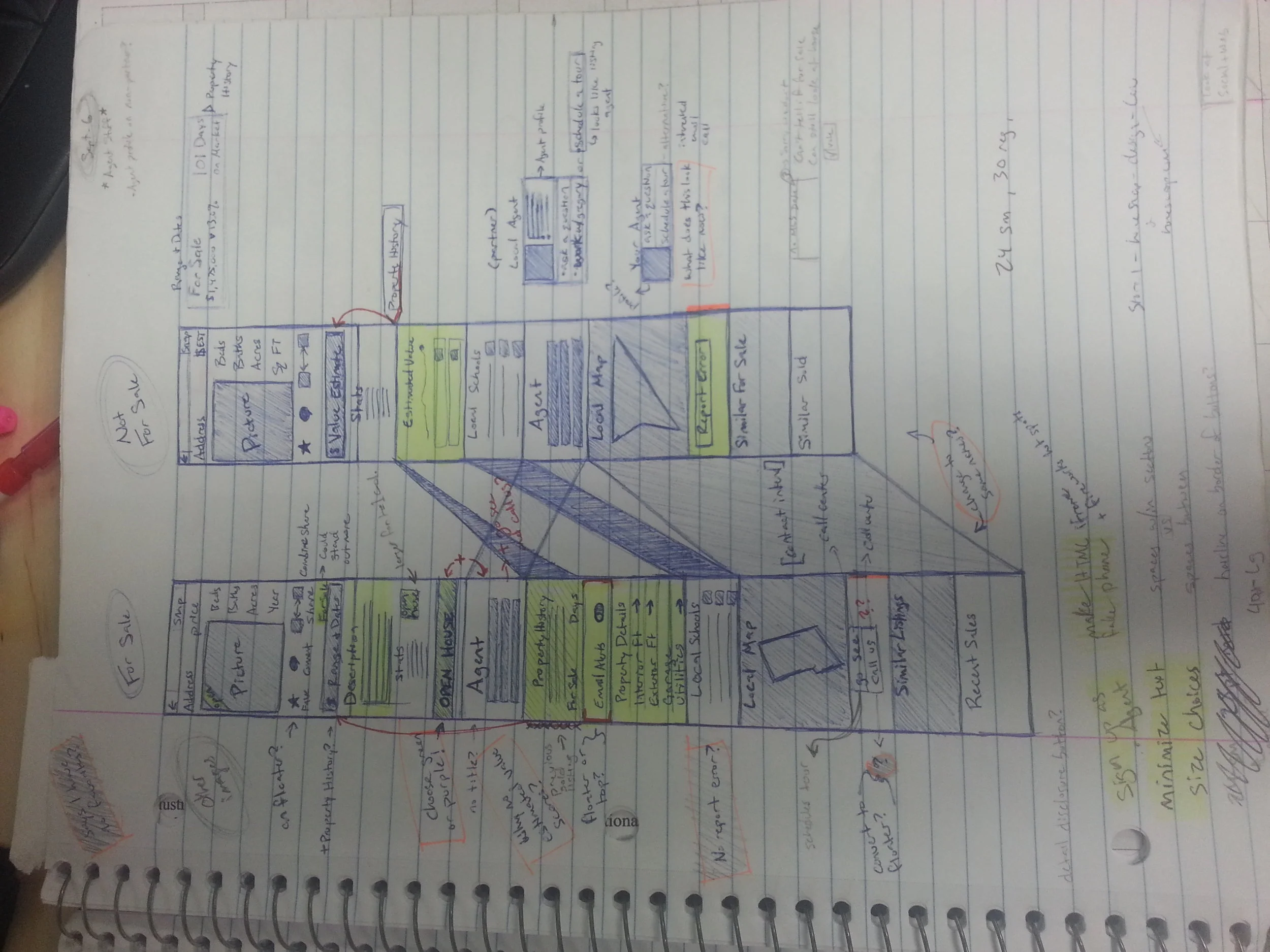
Early On: Getting the lay of the land
When I first started with Homesnap, everything lacked consistency. iOS and Android didn't match up at all, color schemes changed, things seemed to be placed haphazardly. Here are some of the notes I took in exploring the app as it existed at the time. More specifically, the different features of the two different endpoint (property) views: homes that are for sale, and homes that are not. The bones remained, but I did take out excessive imagery and the randomly appearing communication-based buttons as well as mandate that sections appear in the same order to promote consistency.

There were still many things I would have liked to test on these views, like a more dynamic handling to the full-bleed image at the top that would make it clear that there was more information to scroll through, and a combining of inside and outside sharing portals because it can be confusing to the users. But creating this consistency and removing unhelpful features from places where they didn't make sense was a pretty solid place to start.

Invite Wizard
On the original platform, both users and agents could only invite one person to connect with them in the app at a time. They could also only recommend a property to one person at a time. While not overly problematic for the average user who will only interact with a handful of people in their home search, bulk actions are much more useful to agents wanting to conduct their business through the app. The more agents getting people using the app, the larger the user growth! Here's an excerpt of expectations set in a meeting at the beginning of the process:
Objectives
Make it easier and faster for agents/consumers to invite clients/friends
Minimize the distinction between pending and confirmed clients/friends
Do a better job of describing the value proposition behind invitations, especially for agents
Make it easier to accomplish common cases:
For agents: add another agent to your address book
For agents: share your "Invite URL" on Facebook/Twitter
Recommend homes to existing or new clients/friends
Desired Results
Generate 10x invites
Generate 10x property recommendations
Increase agent satisfaction: More accurate client accounting. Better email marketing management tools.


Interaction
Interaction
Navigation
While I personally really enjoy the space and organization that a drawer provides, many people have trouble figuring them out. They're very "out of sight, out of mind," sometimes even literally because they can still be accessed even when the top left icon has changed to the back/up icon. For this reason, when using drawers I suggest considering them a "power user" feature; they're very helpful for the people who are tech-savvy enough to understand the functionality but can't be counted on as the only form of navigation for the layman. Are there organic places for the different sections of the app to link to each other outside of the static drawer navigation? Does the drawer space get notifications that would draw the user's eye and train them to use it? Including this type of navigation can sometimes be complicated, but can also be worth it if handled properly.
Having a scrolling drawer adds extra complication, as even people who are used to using them may not realize that there's additional options to scroll through if the screen ends too nicely between lines. You have your most important information "above the fold" which is good, but spending a little more time handling the imagery at the top may allow to you show most, if not all, of the categories.

You seem to be using the back/up arrow that takes the place of the drawer icon as a literal "back" like the one found on a browser. This is a little tricky because while we're conditioned to use it that way already, that's not how Android is set up to work. Even though this isn't likely to effect you based on how (I'm assuming) the business is set up, this kind of functionality causes major roadblocks when/if you're trying to get promotion from Google. But what does come in to play is the long line of previous actions that you can end up going through that aren't really necessary. The most obvious place I saw this happening is on the "tabbed" (is it tabbed?) version of "My Plan." Because they all appear to exist in the same space it's a little confusing that hitting back may cycle you through each one several times, and if the user is unaware of the drawer that may be the only way they can find to try to get back to "School Feed" which they may consider their homescreen/starting place. Strategic placements of modals could help because they're self-contained, and simplifying the funnels of information in this area may limit the opportunity to get lost.

School Feed

I really like the idea of interspersing the questions among the general news! It's a great way to introduce the idea of questions without overwhelming someone with a whole slew all at one time. If the user actually has an account, unlike me, do the questions get replaced? Mine just stay in place and it feels very odd. Because they appear to be static there isn't any feedback for the action other than the button state changing briefly, which doesn't tell me if it was actually saved or not.
A "yes" indicator instead of just a check mark may give your users more certainty on what exactly they are saying in response to your questions. That or changing the form of the questions into any of the options below applying rather than a yes/no.
.
I'm assuming what's shown in the feed changes when an account is in play. Is it updated with school news? Is it updated with your choices on an account or does it only get specific to interests once you're officially enrolled in a program?
.
There are lots of different image sizes for things that link to the same type of content, is this just for visual interest? Are some programs emphasized over others, maybe because it's a field with more opportunity or a program in need of more students? That's probably something that's flexible, is the school able to change what it wants to emphasize without asking more from you?