
You Need A Budget (or YNAB) is a great product, but a quick usability test reveals that people run into two critical issues with ____.
Objective
Identify the pain points of YNAB’s current onboarding/new user introductions.
YNAB’s current product UI (after gathering user’s intentions)
Test Parameters
What: YNAB web app platform
Who: People with an interest in budgeting, but who are not yet users
Where: Within the comfort (and distractions) of the user’s home
Test Tasks
Sign up for a YNAB free trial
Add financials- bank account access optional for non-video recording
Set a goal
Processing
Reviewing notes, identifying the usability issues and prioritizing them:
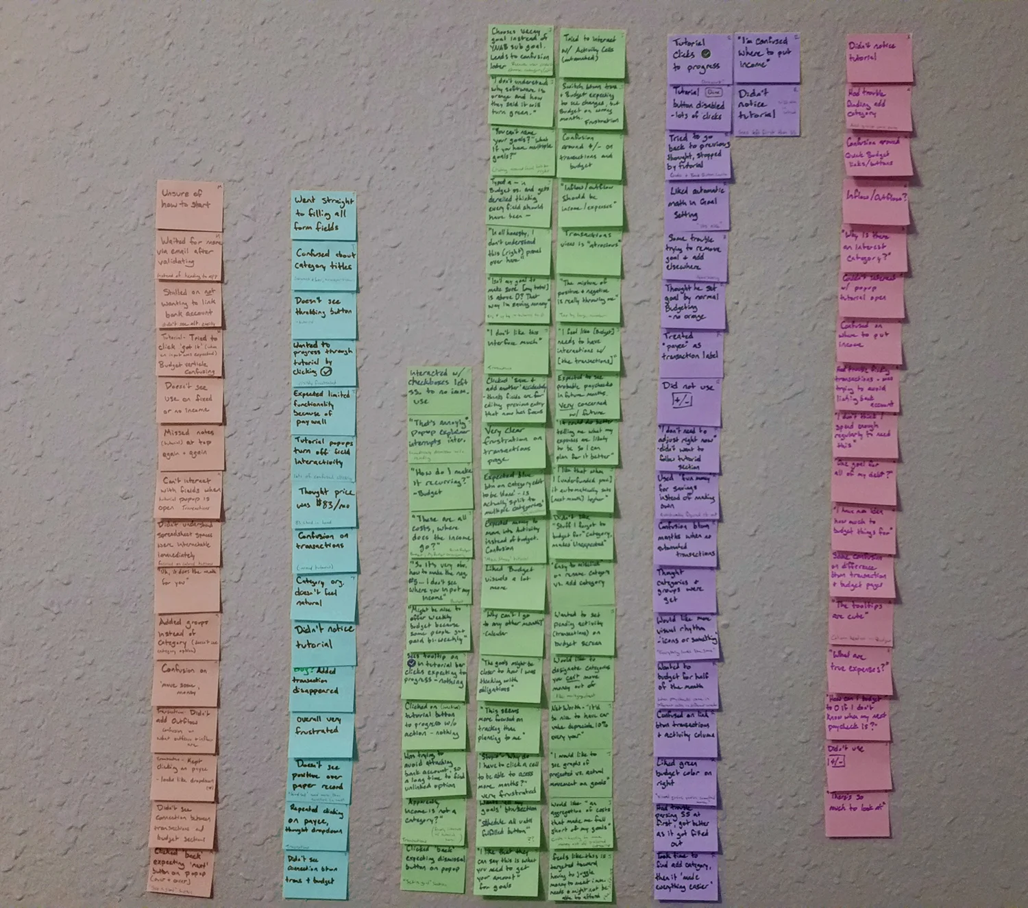
bucketing issues by similarity, then naming the buckets. (Please excuse the edges, I had to stitch multiple images together)
Before (YNAB 4)
Let me start off by saying that the redesign since YNAB 4 looks wonderful! It’s considerably easier to parse the spreadsheet at a glance and everyone that participated in my usability test commented on liking something about how the main budgeting view looks! They also, of course, loved the automated math and adjustments on goals in order to stay on track.
After (current)
Right now your raving fans are most likely to be people who are very motivated to get control of their financial lives. A lot of the juicier information is found outside of the product in the blog (and probably classes), and takes extra work and thought to find. I wouldn’t be surprised if some frustrations with the first impressions are driving away a good amount of users who are outside of your core audience but would still benefit from using YNAB (and further extend your user base). Despite the emails with links to useful blogs, some people just won’t be interested after an awkward first impression.
It was interesting to hear opposite reasons of why YNAB “isn’t for me,” but all stemming from the same opinion of its apparent purpose— tracking. Every person commented on how it seemed more focused on tracking rather than planning. One person was totally cool with that, but was unsure if they would be willing to pay for it. The others either didn’t think tracking would be as useful for them because of little to no recurring income, or had plenty of recurring income but the focus on tracking “feels like [it’s] targeted toward having to juggle money to meet immediate needs.” But every single one of these testers are people with dreams and goals who could benefit from some help being mindful about their money. You and I know that YNAB is capable of more than simple tracking, so how do we make it more obvious to those who have signed up with no guidance?

User Objections
One interesting thing I’ve run across while perusing the YNAB blog is the Wish Farm. It’s already being used to move from simple “recording of purchase details” over to “[making] a concrete, realistic plan for the dollars that you have in your possession, this minute, in order to attain your desired future outcome.” That’s budgeting, right? Adding this concept to the base experience may help to shift the mindset of some potential users away from the humdrum of filling out a form and toward thinking about what it takes to achieve their goals (by using your software).
Maybe add in a little graphic to make it feel special and to break up any visual monotony that happens before numbers start getting logged.
There are a few simple UI changes that you can make that may ease frustration within the current setup.
Transactions: The dropdown carrot on the Payee field should be hidden when there aren’t any options to go through. 5/5
Tutorial: Interactions could use more consistency so the user is sure of what they can and can’t do at any given moment. 5/5
Tutorial: Any popups looking to point to a particular thing should be aligned with that thing. 2/5
Transactions: Can one transaction have both inflow and outflow at the same time? If it’s a binary choice, allow just one.
Transactions: Is there a reason to use “inflow and outflow” instead of “income and expenses?” 5/5
Budget: Setting the Budget month back to the current month may be helpful to new users (as long as there isn’t a reason not to) after they’ve navigated from Transactions back to Budget. Some testers got lost and confused, expecting to see their manual inputs reflected and not realizing they weren’t viewing the correct time period. 3/5
Tutorial: This needs to catch the eye more. The current light bar blends in with chrome, and gets completely missed for about the first 10 minutes of use. 5/5
We've seen it countless times: the same habits that enable rapid growth at a project's outset can actually slow down productivity as teams scale up and complexity mounts. We help others transition to longer-term thinking about the design & testing of their Ruby on Rails and JavaScript applications—all without slowing down the pace of innovation.