

UI & Mobile Designer
Welcome, Accenture Federal!
UI & Mobile Designer
Welcome, Accenture Federal!
I delight in pretty things as much as the next art kid, but there's nothing quite like working out a strategy to give your users a fluid, enjoyable experience that leaves them feeling taken care of without making your developers hate you. An interface should be a set of patterns that make it smooth and painless for people to find what it is they're looking for; that set of consistent rules make it easier on a good developer to create reusable code and stay invested in GUI work. That's the way I approach interface design!
Flat or tactile and immersive, it doesn't matter to me as they both have their place. I am, however, very much a fan of Material design (Google theory) and have been excited to see it evolve with the different ways it's been used. Take a look at some of my work below, and if you enjoy my approach I'd love to hear from you about your projects and how I might be able to help.
Jump Links
Homesnap
During most of my year and a half at Homesnap I was the only designer at the startup, so I worked on a vast range of projects. My primary role was as a mobile designer, but I took care of anything else the company needed. Here are a few of the more relevant projects:
Current Projects
This is the work created so far on my current contract. The original plan was to spiffy up their web app, but a better MVP for what they do was a smaller "stream companion" that could be released much earlier.
A Personal Project (that I touch when I get the chance) is a little "talking" pirate themed game. I'm working on becoming better at front end development, and this is a fun way to practice and learn outside of lessons!
Other

MetaScouter
MetaScouter
MetaScouter is a fully remote startup revolutionizing the competitive console videogame arena by collecting unprecedented data and providing gamer analytics. Popular online competitive games like Dota2, Starcraft 2, and League of Legends have many websites dedicated to tracking player progression, builds, and other statistics but so far these trackable metrics have not been available to those competing in older, console-based games despite a continued and thriving culture. MetaScouter is flipping this on its head with clever software able to scrub data from live game streams so that this subset of gamers will finally have hard data on their performance rather than vague ideas.
They still need their website designed and up, but because they're bootstrapped we started with a "Stream Companion," which is a little web app that allows you (and the tournament announcers/hosts) access to visualized data to remember what happened in each game and aid in talking about it. Games move fast and there's a lot going on at major tournaments, so this is also a great way to keep an eye on matches you may not be able to watch in real time. By getting something out there with events, it also gets their name in the minds of their target audience and primes for their full product.
The design is mobile-focused because a majority of the users are likely to be at the tournament or streaming the matches full-screen at home, but the web app is responsive and can also be viewed on larger devices like a computer.
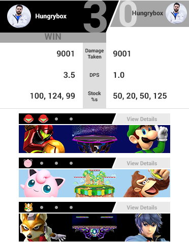
Here's a completed match of 3 games. Competitive Super Smash Bros is a 1v1 game with one character per player and several "stocks" (lives) per game. The objective is to force your opponent to run out of stocks
The style inspiration put forth by the team was the power scouter from DBZ and other "futuristic" interfaces from 90s cartoons. While they definitely had some cool shapes, those were hard to use in the limited confines of a mobile screen. Instead, I combined the chunkiness and angles used in both those inspirations and the menus of the Smash games. The black and grey were originally just for the wireframe, but I started to like it once the colors came in.
Here is an in-progress match. Who will win?! I also included an instance where for some reason something may have gone wrong with the data collection, so the viewer can't click/tap in for more details but they can see the guaranteed basic character and stage information.
This is a popover modal of the game's more specific data. It was originally designed as its own page, but a modal fits better within the infinite-scroller framework. You can see the summary details still, and now additional information like badges earned (images coming soon), a graph displaying the range at which they lose stocks in, and a scrubbing timeline of the game's major events.
The original plan was to get this pushed out by a tournament called Evo (or Evolution) at the beginning of August. I had completed my design but time was running out and the junior developer responsible for the project had a lot on his plate. I developed a quick little version with Bootstrap to help in formalizing some of the spacing and proportions, test out my images, and hopefully lend whatever help I could. It's not much (and realistically he's probably not using it at all), and it doesn't have any of the interaction or fancy angles, but if you'd like to see that the link is below. It's best viewed on a mobile device!
Codepen Project

Homesnap Apps
Homesnap Apps
Still somewhat available for download, but with many differences. I'll be making full prototypes soon to document my work!
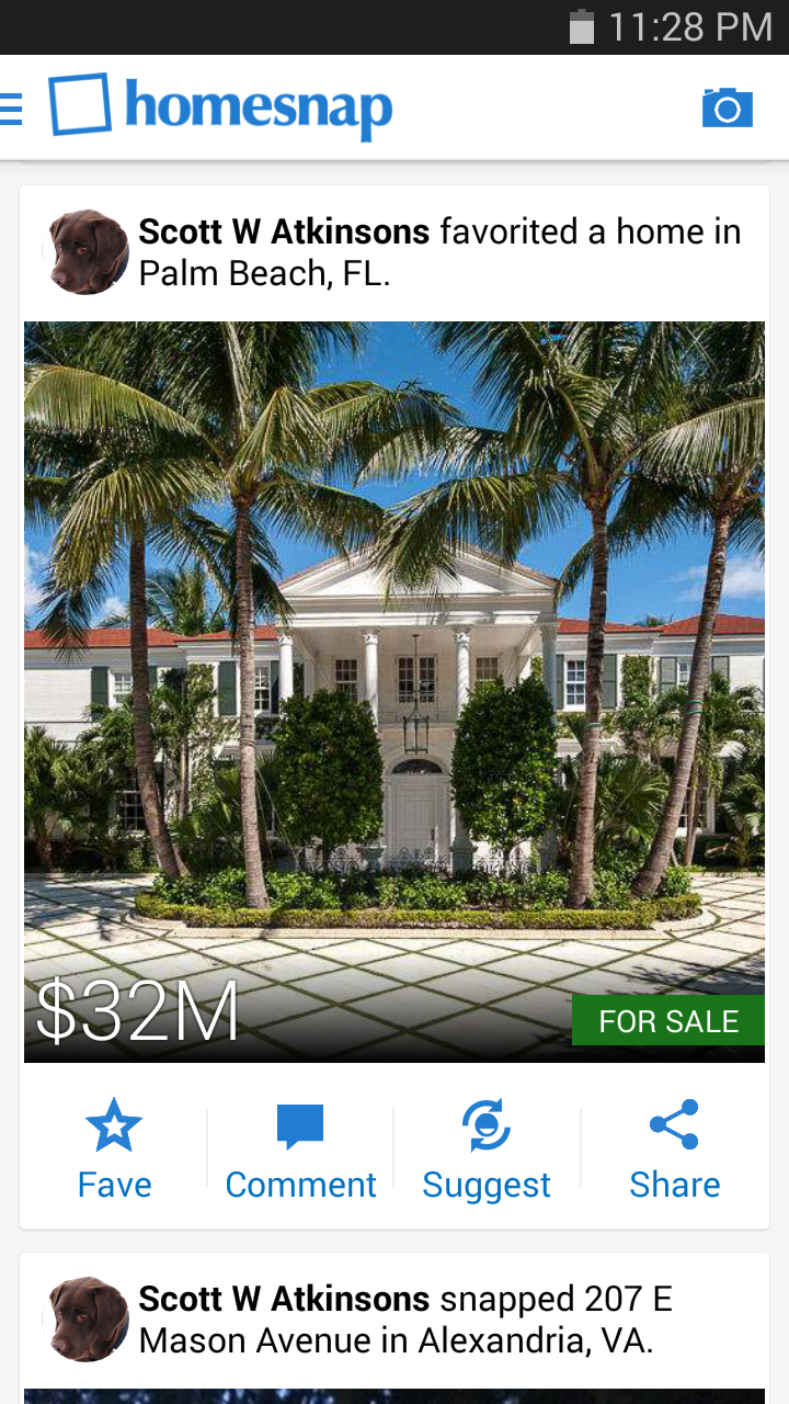
Because iOS and Android systems are set up differently, with separate ideas of what various visual tools mean, and audiences that are accustomed to different environments, I purposefully chose to handle each differently. Some are effects like image blurring or adaptive text sizing (which are significantly easier on iOS), and some are larger issues like how to best handle navigation with what's available. Overall, the brand remains consistent.
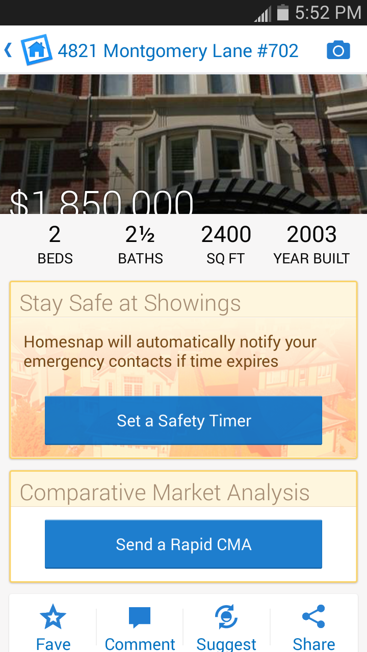
Below is the main attraction of the app: where all of the pertinent information is held and what we referred to as the endpoint. We went with a large image to begin with partially because it was the fad of the time, but also to have some sort of striking visual among what is generally just a huge block of data. Later, I liked the idea of a smaller image that you can make larger so that it's more apparent that there is information being loaded underneath, but the concept proved to be too taxing for the developers at the time.


^^ scrollable ^^
Android Navigation
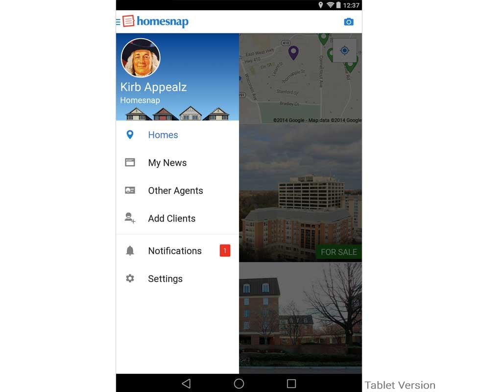
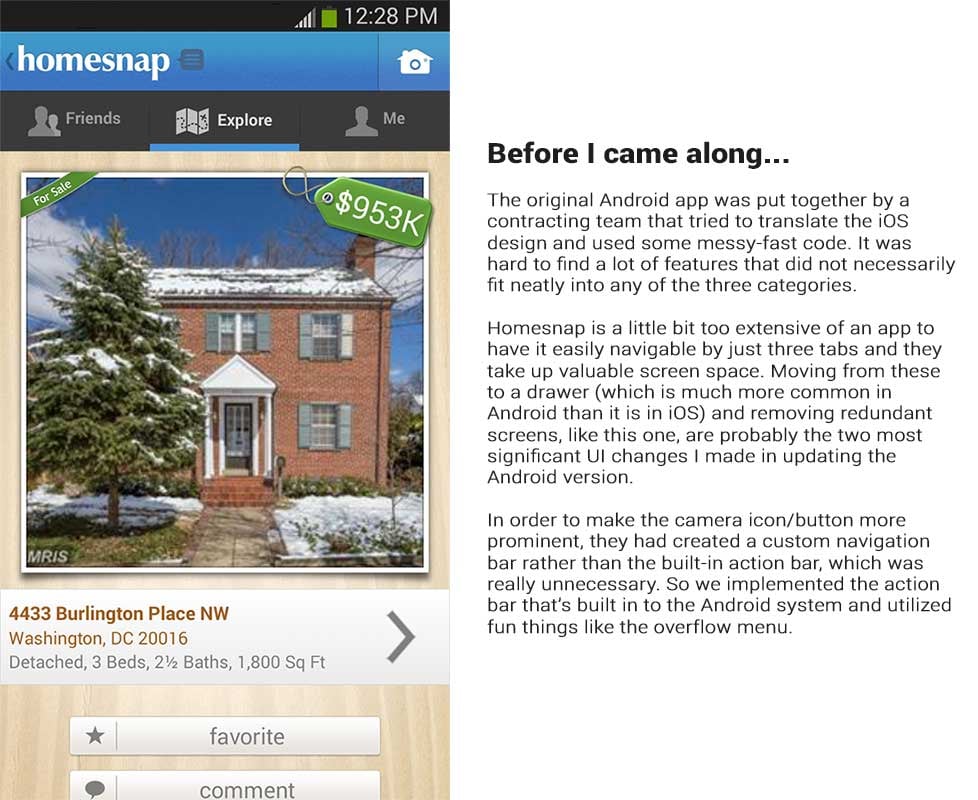
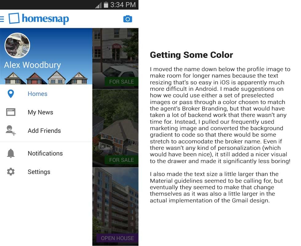
While iOS may have gotten more of a face lift for the big iOS7 release, the first few Android updates were closer to being an overhaul. Because most of the users and the people working at Homesnap all used Apple products, the Android platform hadn't gotten the attention it deserved. Being an Android user myself, this bothered me quite a bit and I was super excited when we were finally done with the iOS7 release and I could dig in to making it better!
There were many changes; some were to modernize aesthetics but many were to clarify navigation and reduce redundancy. Here is the journey of the navigation drawer.


iOS Navigation
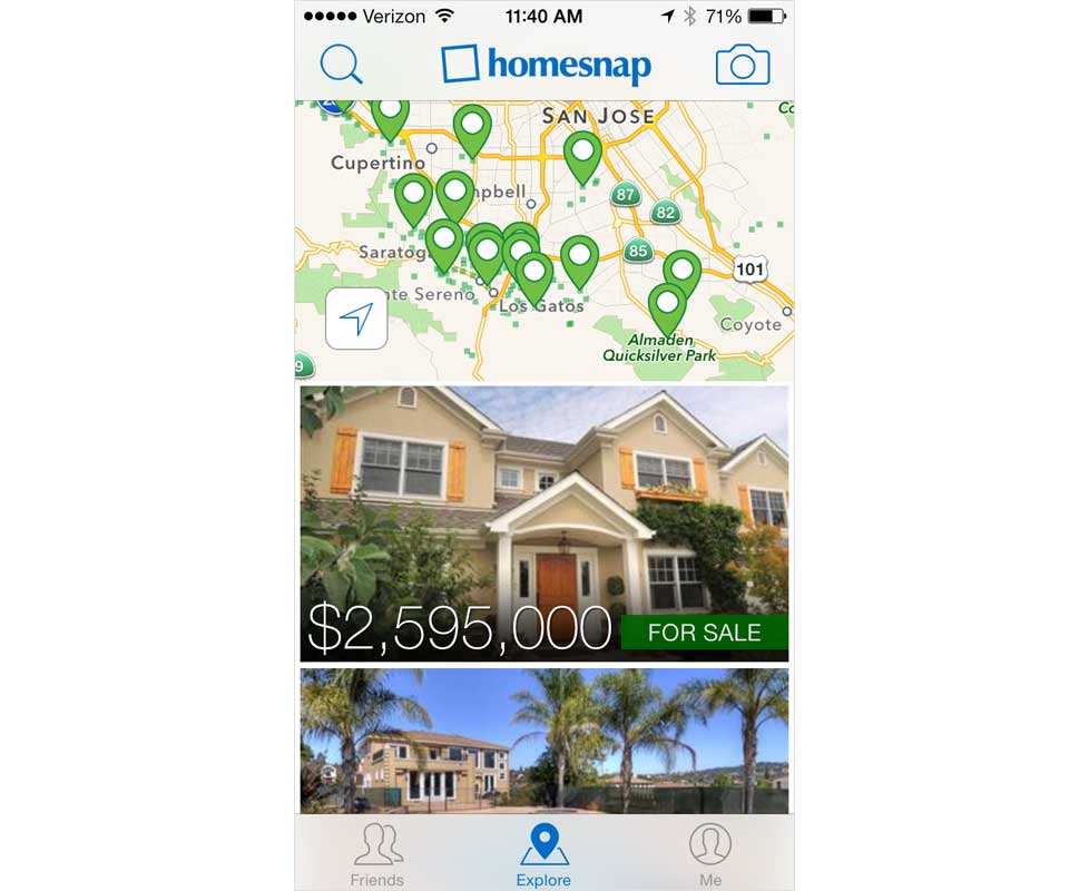
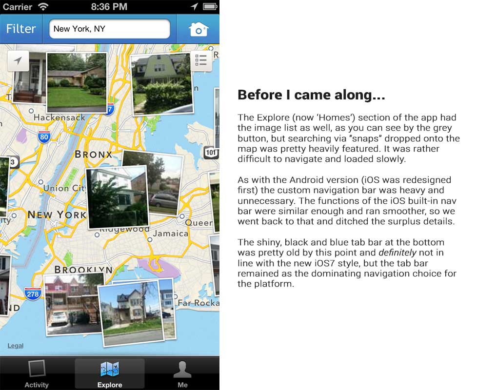
iOS didn't have nearly as many obvious changes as Android did, partially because it was kept more up-to-date. The majority of the work on iOS, as far as navigation is concerned, were cosmetic upgrades to "flat" design (though I'm not a fan of that term because overall it's not truly flat) and getting rid of the occasional redundancy.
Agent Features
Homesnap is a space where both real estate agents and house hunters can view a mix between public records and MLS data (Multiple Listing Service: database where agents share information about properties). Because an MLS shares some private information, certain things have always been restricted to agent accounts.
In order to carve out a niche from all of the real estate apps on the market, we began to make it a little more agent focused by providing special profiles, tools, branding space, and more. This was exciting for me since the reason I went to work for Homesnap is that my mother is an agent and the software she had available was always so awful (the best MLS in the country didn't even have mobile access) and I wanted to make it better!

Here, we have the agent profile as it can be seen by other agents. I'm showing what I think was a happy medium between what we had and where we should have been going that never got implemented, but you can find what I would have liked and what was actually current above.
Other Screens

Homesnap.com
Homesnap.com
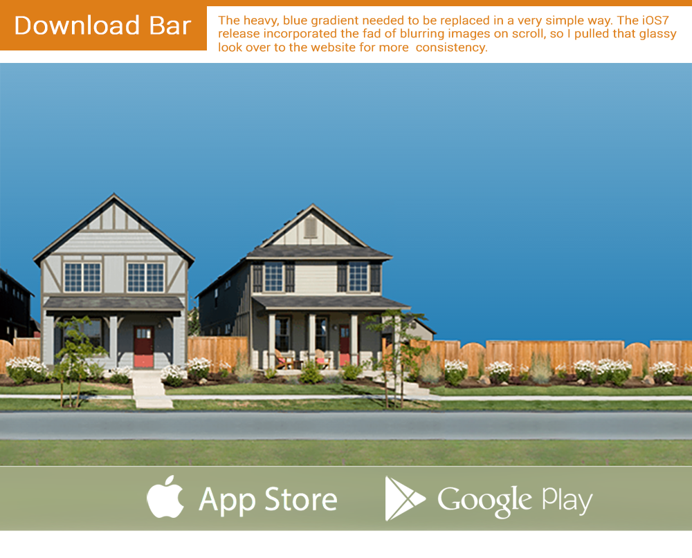
We were coming up on the big iOS7 release and the website still matched the old, heavy style that permeated everything. I quickly made a plan to update the homepage and navigation bars to go along with our new style in a way that could actually be completed by our overloaded web developer. Click the image below to toggle between the expedited renovation and the previous version.


Details

RNG Pirate Crew
RNG Pirate Crew
In order to help me learn my front-end development better, I started a side project to parse written English. I knew it was an undertaking WAY over my abilities, but I was curious as to how far I could get. In order to make it both more enjoyable and more accessible it ended up branching into much smaller and more realistic projects. One was essentially creating a setup for dialogue trees (I was trying to avoid that but it ended up there anyway), and another was this. How varied and interesting can I get characters to be through "randomly" assembled features?
It doesn't do much yet, between still being fairly beginner at JavaScript and the grand undertaking that is crafting personalities my project is in its infancy. If you click through the image above you'll find what I consider my MVP (minimum viable product) hosted on Codepen. The first steps were:
- At least a little visual appeal. Nobody likes seeing a designer not design stuff.
- Having it work on both desktop and mobile.
- "Rolling" a name for the user.
- "Rolling" a name, appearance set, and phrases for characters upon request (button click).
- The appearance of a rudimentary conversation with each character created.
I figured the best way to create as many possibilities as I could while leaning on my strengths would be to break the image into pieces while leaving open space to fill in with flat colors programmatically. With 9 head images, 9 body images, 16 face colors, and an ever-growing array of clothing colors, I was able to create...
Over 71,000 unique characters!
But since some colors will undoubtedly be too similar to be considered unique, then definitely over 81! Which is still pretty neat.
Now I've moved on to hopefully "roll" individual personality traits while possibly combining them with names and visual features, add the ability to speak to a character multiple times, and take the conversation beyond the introductory "hello," "my name is _," and "nice to meet you." If you're interested in seeing progress on that and won't be offended to run into code that's still breaking, visit the link below!

Knitting App
Knitting App
This is an animated prototype for a mobile app that I made for a college class predating the Flat Design movement. It's a knitting app that allows you to count stitches, keep track of projects, and create patterns. The course, at the time, was big on immersive, tactile design; using elements that are associated with the action or theme in the work itself.
Knitting App Screenshots
Process Work
I've been teaching myself how to knit for a while now and I thought, "how great would it be to have an app that would visualize patterns for you so it would be easy to make your own?" This was my first attempt at designing an interface for that idea, using a paper feel to get the user into a crafty mood (I had tried out several yarn-based design ideas and they always seemed too visually cluttered). I look forward to updating it sometime to streamline navigation and lighten it up, then possibly creating it for real!

Curling Milestones
Curling Milestones
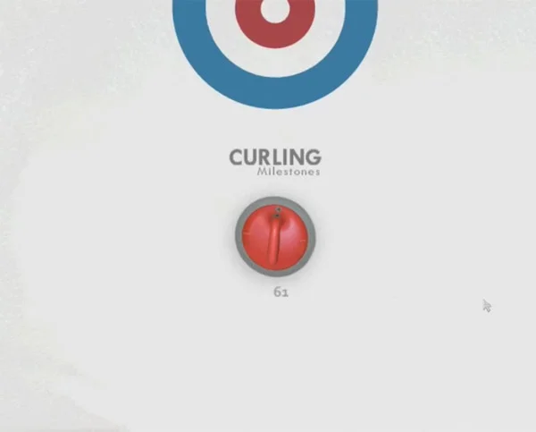
We had a project to design a website that would visualize a timeline in a way other than just points on a line. I had taken a curling class recently (I had to figure out what was going on with this weird sport) and decided to run with that.
Curling Milestones Screenshots
Process Work
The loading animation is probably my favorite part. I really enjoy that 100 percent ends with the stone landing on the button (center of the target). We were supposed to consider making an interactive loader to entertain viewers during the wait to which I would have had the mouse be a broom that you could scrub out a path with, but I would hope to create something that didn't keep people waiting!

Facebook Ads
Facebook Ads
When I first started at Homesnap, one of my duties was to handle the Facebook Ads that we ran. Here's just a few of the images, though the text that went along with them has been lost to time. Eventually we started outsourcing the Facebook ads to a company so that I had more time to focus on other things.
General
Special Event
Agent Targeted

Branding
Branding
Homesnap
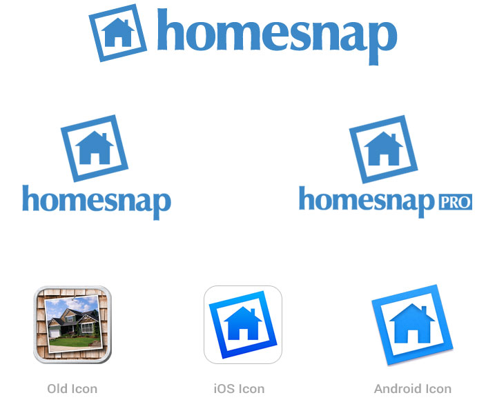
At the very end of our rush to update the app for the big iOS7 release, I had the opportunity to update the company's branding. The CEO would have preferred an abstract concept, but we decided as a company that something more immediately recognizable as a house would be helpful in conveying the point of the app, and I kept the idea of the tilted snapshot to stay consistent with the branding they had been using for quite a while already.
I also handled the logos of many MLSs and independent real estate agents; resizing and making small edits to ensure optimal quality of their branding wherever the brand appeared across the various platforms. Occasionally, an MLS may not quite have a logo, and if that's the case I'd make one! This is an example of something I would whip up in the limited amount of time I could dedicate. They loved it!
The "branding" that they had provided.
Firefox Add-on Makeover Winners
During my internship at Mozilla, one of my major projects was to create new icons/logos for the winners of a little competition they had. Users were able to nominate and vote on 5 add-ons to have their branding redone by a Mozillian designer (me). I worked with each developer via email and, after many iterations for each, ended up with the ones below. The Webmail Notifier one is functional and contains all of the different states of their notification icon.
Other


